- Video Guide
- Why do you need the Range Slider Pro Plugin for Contact Form 7?
- 1. Provides a Better User Experience
- 2. Supports Min & Max Value Customization
- 3. Works with Conditional Logic
- 4. Pre-Populated Default Values
- 5. Custom Styling & Animations
- 6. Supports Multi-Step Forms
- 7. Perfect for Pricing & Calculations
- 8. Mobile-Friendly & Touchscreen Compatible
- 9. Real-Time Value Display
- What's Needed
- How to use Contact Form 7 Range Slider Pro Addon?
- Live Example of CF7 Range Slider Pro
A range slider is an essential tool for collecting precise numerical data from users in an interactive way. While our free range slider add-on already provides basic functionality, some users require more advanced customization to better suit their needs.
To address this, we have introduced the Range Slider Pro add-on, which enhances the feature set and provides greater flexibility in styling, functionality, and user experience. Whether you need custom step values, dual-handle sliders, or more precise control over data input, the pro version allows you to tailor the range slider exactly as required.
If you’re looking to enhance user experience and create interactive, user-friendly forms, the Range Slider Pro Plugin for Contact Form 7 is a must-have. This powerful addon lets you add customizable range sliders to your forms, allowing users to select values dynamically rather than typing them manually. Whether you’re building pricing calculators, donation forms, product selection, or survey forms, a range slider improves functionality and makes forms more engaging.
Video Guide #
If you need further guidance, watch our video tutorial that walks through the entire process of setting up our Range Slider Pro Addon for Contact Form 7:
Why do you need the Range Slider Pro Plugin for Contact Form 7? #
If you’re looking to enhance user experience and create interactive, user-friendly forms, the Range Slider Pro Plugin for Contact Form 7 is a must-have. This powerful add-on lets you add customizable range sliders to your forms, allowing users to select values dynamically rather than typing them manually. Whether you’re building pricing calculators, donation forms, product selection, or survey forms, a range slider improves functionality and makes forms more engaging.
1. Provides a Better User Experience #
A range slider simplifies data entry by allowing users to drag and select values effortlessly, instead of manually inputting numbers.
2. Supports Min & Max Value Customization #
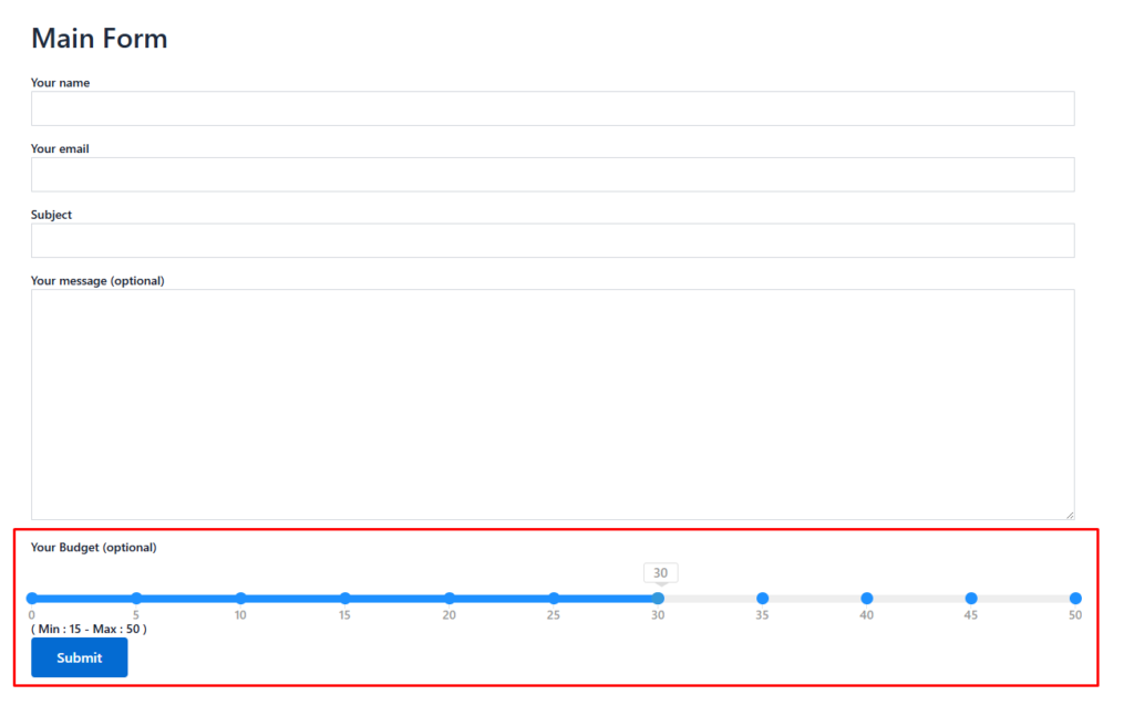
Define a minimum and maximum value range to control user input, ensuring they select only valid options.
3. Works with Conditional Logic #
Show or hide fields based on the selected slider value, making the form dynamic and responsive.
4. Pre-Populated Default Values #
Set a default position for the slider so users start with a recommended value, enhancing ease of use.
5. Custom Styling & Animations #
Easily adjust colors, styles, and animations to match your website’s branding.
6. Supports Multi-Step Forms #
Use sliders within multi-step forms to guide users through a structured form completion process.
7. Perfect for Pricing & Calculations #
Great for custom price estimators, service selection, or donation amount selection, allowing users to adjust values interactively.
8. Mobile-Friendly & Touchscreen Compatible #
Ensures a seamless experience on desktops, tablets, and mobile devices with smooth touch interactions.
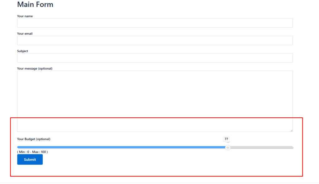
9. Real-Time Value Display #
Show the selected value in real-time as users move the slider, providing immediate feedback.
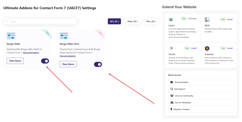
What’s Needed #
- Ensure that both Contact Form 7 and Ultimate Addons for Contact Form 7 are installed on your WordPress site.
- Download and install Ultimate Addons for Contact Form 7 Pro from our client portal.
- Activate your license key.
- Go to Ultimate Addons > All Addons menu in your WordPress dashboard and enable both Range Slider and Range Slider Pro checkboxes.
How to use Contact Form 7 Range Slider Pro Addon? #
Step 1: The Multistep Form Free to Pro migration #
After enabling the Range Slider Pro Addon, it functions just like the free range slider but comes with several additional features that enhance customization and user experience.
For users who are already familiar with the free version, the Pro Addon builds on the existing functionality, offering more styling options, improved step management, and better user engagement.
If you’re new to range slider field, you can check out the documentation for the free Range Slider Pro Addon here to get started before exploring the Pro features.
Step 2: Additional Pro Features #
In addition to the free version of the range slider, we have introduced several pro features to offer more customization and control over the slider’s behavior and appearance. These enhancements allow you to fine-tune the range slider according to your specific needs, making it more flexible and user-friendly. With advanced styling options, step control, dual-handle functionality, and custom labels, the pro version provides greater precision and a more interactive experience for users.
After going to the editing panel of the form, click on the “Range Slider” tag. In the tag options, you will find several pro features that enhance the functionality of the range slider. Let’s go through them one by one and explore how they can improve your form’s usability and customization.
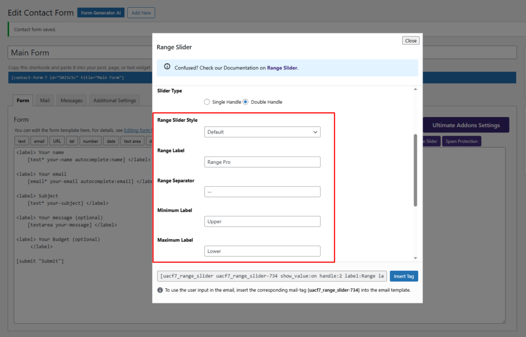
Range Slider Style #
The first pro option of the Range Slider Pro is the Range Slider Style. In this feature, you have four different styles to choose from, allowing you to customize the look and feel of the slider according to your form’s design. These styles provide flexibility and a more visually appealing experience for users, ensuring that the slider matches your website’s overall theme and branding.
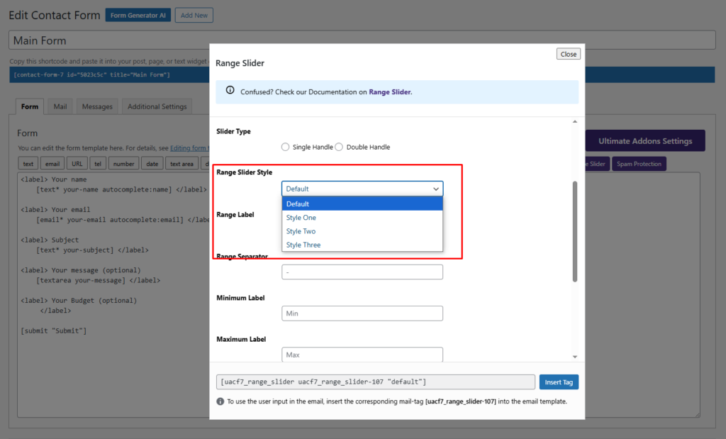
Here are the three styles available in Range Slider Pro:
1. Default Style #
2. Style One #
3. Style Two #
4. Style Three #
Range Label #
The Range Label is the text that appears within the range slider area, helping users understand what the slider represents. It provides context to the selected value, making it easier for users to interact with the form. You can customize the label based on your needs to ensure clarity and improve the overall user experience.
Range Separator #
The Range Separator is the character or symbol used to separate the Range Label from the Minimum Value Label in the range slider. This helps in clearly displaying the range of values available for selection. You can customize the separator to match your form’s design and readability preferences.
Minimum Label #
The Minimum Label is the text displayed at the starting point (left pole) of the range slider. It helps users understand the lowest possible value they can select. You can customize this label to provide better clarity based on your form’s purpose.
Maximum Label #
The Minimum Label is the text displayed at the starting point (left pole) of the range slider. It helps users understand the lowest possible value they can select. You can customize this label to provide better clarity based on your form’s purpose.
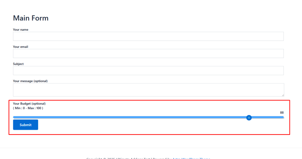
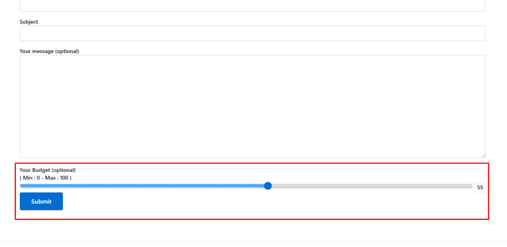
Here are the backend settings.
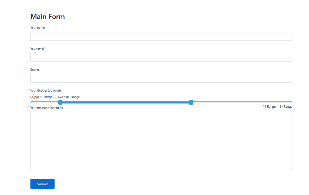
Here is the frontend view of the Range Slider Pro.
Step 3: Testing the Form Settings #
After configuring all the settings, it’s time to test the form to ensure everything is working as expected. Fill out the form step by step, check if the fields are displaying correctly, and verify that the form flow is smooth.
Live Example of CF7 Range Slider Pro #
If you want to see how the Range Slider Pro add-on works in real-time, you can check out our live demo form at the following link. This interactive demo allows you to experience how frontend post submission works.
Click here to test the Range Slider Pro Add-on in action!
Still Not Clear? Please contact us. If you are a free user, you can open a ticket from here. If you are a Pro user, you can open a ticket from here.