We offer a free add-on called WooCommerce Product Dropdown, which allows you to display WooCommerce products in a dropdown menu within your Contact Form 7. However, the free version has limited features and lacks advanced customization options.
To overcome these limitations, we have developed a Pro add-on that gives you greater flexibility and control over how product dropdowns appear and function in your form. With this Pro version, you can customize the product display, filter products, adjust styling, and enhance the user experience according to your specific needs.
Video Guide #
What’s Needed #
- Ensure that both Contact Form 7 and Ultimate Addons for Contact Form 7 are installed on your WordPress site.
- Download and install Ultimate Addons for Contact Form 7 Pro from our client portal.
- Activate your license key.
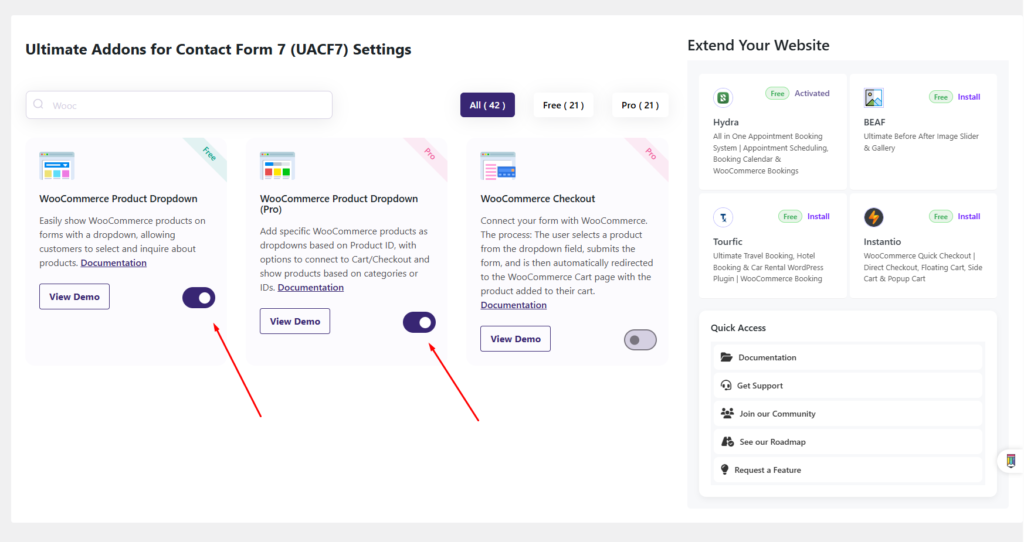
- Go to Ultimate Addons > All Addons menu in your WordPress dashboard and enable both WooCommerce Product Dropdown and WooCommerce Product Dropdown (Pro) Checkboxes.
How to use WooCommerce Product Dropdown Pro Addon? #
Step 1: Create your desired form #
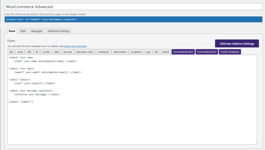
First, you need to create a Contact Form 7 form to use the WooCommerce Advanced feature. We will go over how to group fields and configure settings later, but for now, you need a form to work with. To keep this tutorial simple, I will use a basic form as an example. You can modify it later according to your needs.
Step 2: WooCommerce Product Dropdown Settings #
After creating the form, it’s time to configure the settings based on your requirements and explore the Pro options available. The Pro version unlocks advanced customization features, allowing you to tailor the product dropdown, adjust display settings, apply filters, and enhance user experience. Let’s go through the settings to ensure your form is set up exactly how you need it.
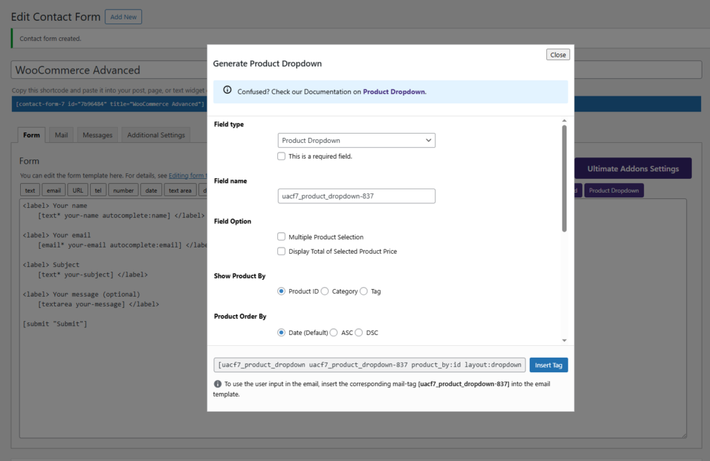
To use the Product Dropdown Pro fields, first, click on the “Product Dropdown” tag from the top of the Contact Form 7 editing panel. This will open a popup settings panel where you can configure advanced options for displaying WooCommerce products within your form.
Let’s go through each setting briefly to understand how they work and how you can use them to customize the WooCommerce product dropdown in your form.
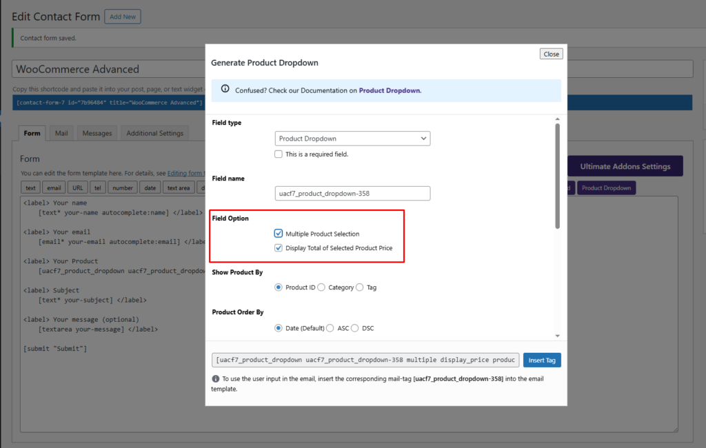
Field Option #
With this field option, you can enable “Multiple Product Selection,” allowing users to select more than one product when submitting the form. This is useful for forms that require users to choose multiple items at once.
Also, you can choose whether to display the total price of selected products by enabling the “Display Total of Selected Product Price” option. This feature helps users see the cumulative cost of their selected items before submitting the form, improving transparency and user experience.
Show Product By #
Using this option, you can specify how the product list will be displayed on the frontend. You can choose to show products based on:
- Product ID: Display specific products by entering their unique WooCommerce product IDs.
- Product Category: Show products that belong to a particular category, making it easier to filter relevant items.
- Product Tag: Display products using WooCommerce product tags, allowing for more refined selections.
This flexibility ensures that users see only the relevant products in the dropdown, improving the selection process and user experience.
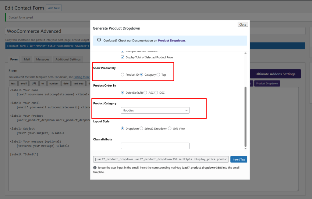
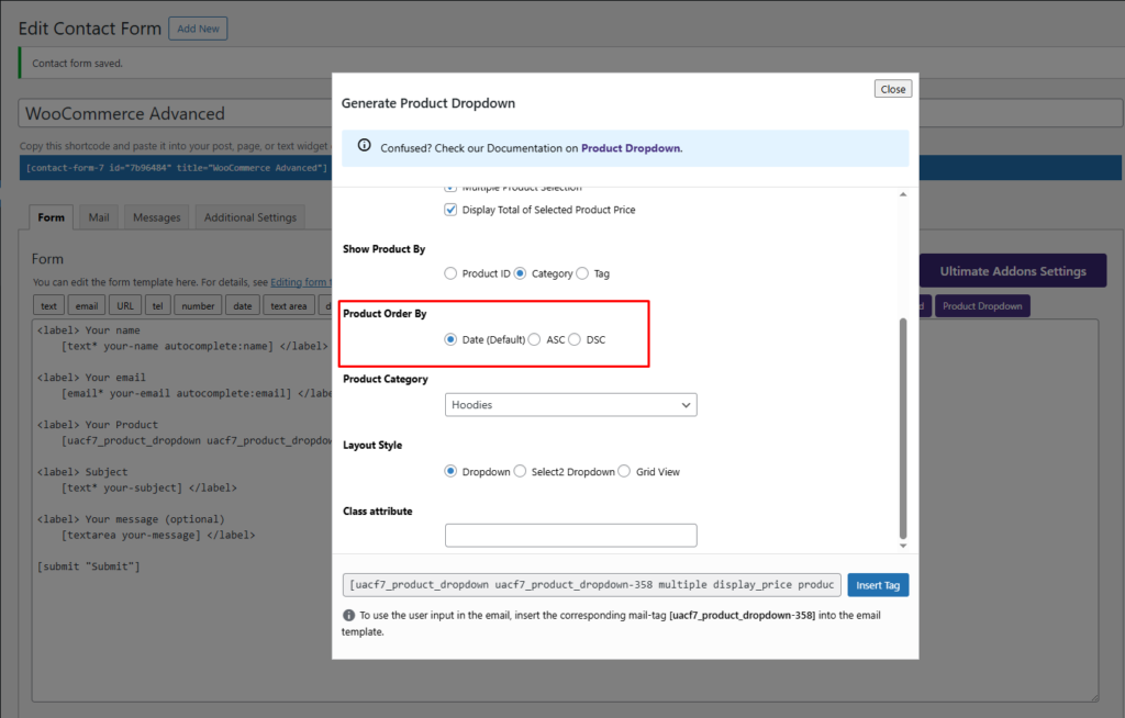
Product Order By #
With this option, you can control the order in which products appear in the dropdown. You can choose to sort products by:
- Date: Display products based on their published date, with the most recent products appearing first. It is default option.
- Ascending (ASC): Arrange products in alphabetical (A–Z) or from lowest to highest price.
- Descending (DESC): Arrange products in reverse alphabetical order (Z-A) or from highest to lowest price.
This option allows you to organize product listings in a way that best suits your form’s purpose and enhances the user experience.
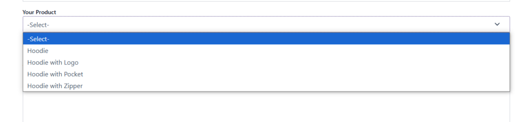
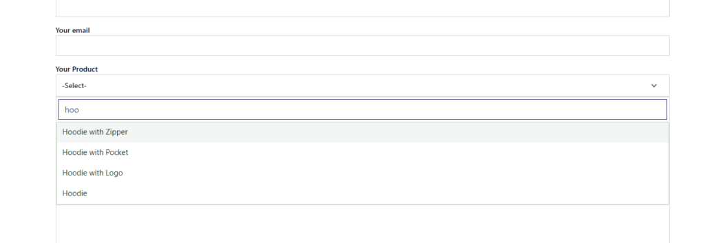
Layout Style #
With this option, you can customize the style of the product dropdown to enhance the user experience. You can choose from the following display styles:
- Dropdown: A standard dropdown menu where users can select a product from a list.
- Select2 Dropdown: An improved dropdown with search functionality, making it easier for users to find and select products.
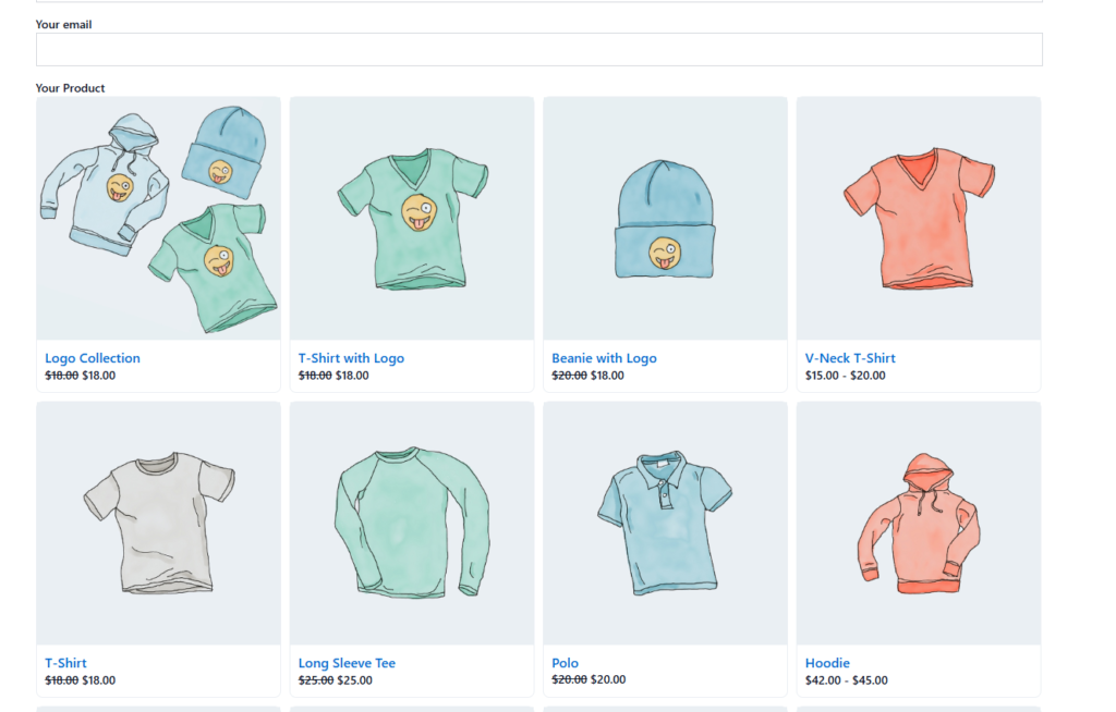
- Grid View: Displays products in a grid format with images, providing a more visually engaging selection process.
Here is the frontend example of Dropdown Layout.
Here is the frontend example of a Select2 dropdown layout.
Here is the frontend example of a Product Grid layout.
This flexibility allows you to tailor the product selection experience to match your website’s design and user preferences.
Class attribute #
Here you can specify the class attribute for custom styling.
After filling out all the necessary fields, click the Insert Tag button to add the generated field tag to your form. This will place the Product Dropdown Field into your form structure, ensuring it appears correctly in the flow of the form. You can repeat this process to add multiple dropdowns and create a seamless, interactive form experience.
Step 3: Testing the Form Settings #
After configuring all the settings, it’s time to test the form to ensure everything is working as expected. Fill out the form step by step, check if the fields are displaying correctly, and verify that the form flow is smooth.
Live Example of CF7 Product Dropdown Pro #
If you want to see how the WooCommerce Product Dropdown works in real-time, you can check out our live demo form at the following link. This interactive demo allows you to experience how frontend post submission works.
Click here to test the PDF WooCommerce Product Dropdown Pro addon in action!
Still Not Clear? Please contact us. If you are a free User, you can open a ticket from here. If you are a pro user, you can open a ticket from here.